
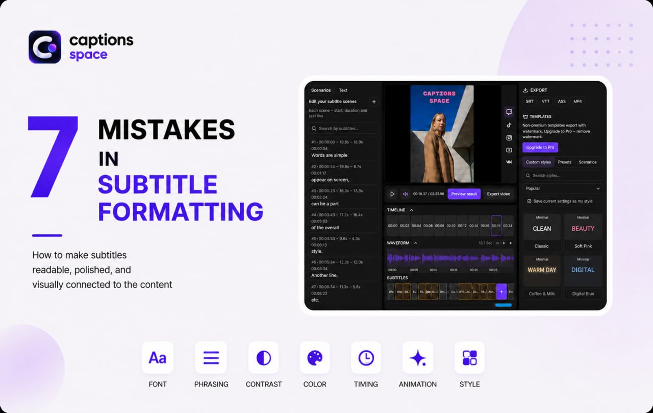
Subtitles can make a video easier to understand and more visually engaging, but poor design has the opposite effect. Tiny fonts, long lines, too many colors, and excessive animation distract viewers from the content and make captions harder to read.
This is especially noticeable in Reels, TikTok videos, YouTube Shorts, ads, and educational content, where viewers process speech, visuals, and text at the same time.
Let’s examine seven common subtitle design mistakes and learn how to make on-screen text readable, polished, and visually consistent with the content.
Mistake 1: Using a Font That Is Too Small or Complex
Thin strokes and decorative letterforms may look beautiful in a static design, but they are difficult to read in a moving video, especially on a smartphone.
Clean, legible fonts work best for educational, expert, and business videos. Beauty, fashion, and lifestyle content can use more expressive typography, but readability should still come first. Use the subtitle font guide to compare weight, outlines, and reliable defaults. You can also use your brand font in subtitles, provided the text remains easy to distinguish on a small screen.
Mistake 2: Putting Too Much Text in One Subtitle
Placing an entire sentence on a single line is a common mistake. Viewers have to read long phrases while following the video, which makes the content harder to process. Break dialogue into short, meaningful segments instead. For example, “Today I’ll show you five ways to make your videos more engaging” can appear as two consecutive subtitles.
After automatically transcribing speech, check not only the accuracy of the text but also the length of each caption.
Mistake 3: Poor Contrast Against the Background
White text on a light background or dark text on a dark frame is almost impossible to read. Because video imagery constantly changes, the same subtitle color may look clear in one shot and disappear in the next.
Use contrasting colors, a subtle background, a shadow, or an outline. Test the subtitles across several different frames: they should remain readable over both light and dark areas without the background treatment drawing too much attention.
Mistake 4: Using Too Many Colors and Highlights
Color is effective when it follows a consistent system. If every word uses a different color, the visual hierarchy disappears. For most videos, one primary text color and one or two accent colors are enough. In a phrase such as “These 3 mistakes reduce video quality,” for example, you could highlight the number and the word “mistakes.”
In educational content, color can emphasize terms and numbers. In promotional videos, it can highlight benefits, prices, and calls to action. Branded content can use brand colors. Strong subtitle design relies on hierarchy, not on the number of different shades.
Mistake 5: Displaying Subtitles at the Wrong Time
Even perfect typography cannot save subtitles that noticeably lag behind the speech or appear before a phrase is spoken. Viewers then have to match the audio with text from a different line. Timing and synchronization are therefore just as important as design.
After generating subtitles automatically, watch the video and check the start and end of every caption, especially in fast dialogue and short-form content. The timeline guide explains how to adjust text and timing before moving on to visual styling.
Mistake 6: Adding Too Much Animation
Effects such as Zoom, Fade In, Slide Up, and Glow can make subtitles more dynamic. But when every frame is filled with moving, growing, and flashing words, attention shifts from the message to the effect.
Animation should match the character of the video. A calm text entrance is usually enough for interviews and educational content, while Reels, TikTok videos, and ad creatives can support more energetic effects. A useful rule is simple: if viewers notice the animation before they can read the phrase, simplify the design.
Mistake 7: Giving Every Video a Different Style
One video uses minimalist white text, the next uses yellow bold lettering, and a week later there is a different font and animation. Constantly changing the style makes it difficult to build a recognizable visual identity. Define a small design system in advance:
- a primary font and an accent weight;
- primary and secondary colors;
- a consistent way to highlight important words;
- a default animation style;
- a standard text position.
Over time, recurring typography and colors become part of a creator’s or brand’s visual identity.
How to Design Subtitles Properly
There is no universal design for every video. Minimal subtitles suit interviews, editorial typography works well for beauty and fashion content, and large dynamic captions fit entertainment videos. The basic principle, however, is always the same: the text must be easy to read, and the design should support the message rather than compete with it.
With Captions Space, you can generate subtitles using AI, review their text and timing, and then choose a ready-made designer style or create your own by changing fonts, colors, effects, and animation. The subtitle style gallery provides starting points that you can adapt to your video format.